Ask on the Third Date: The Notification Permission Strategy Most Apps Get Backwards
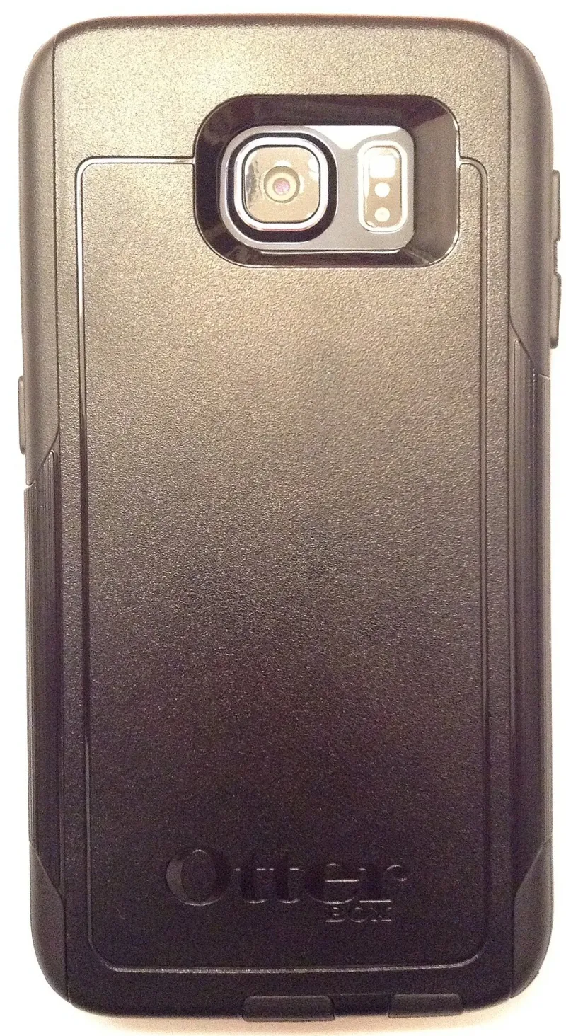
Photo: User:B, CC BY-SA 4.0, via Wikimedia Commons
There's a moment in every app's life that gets about four seconds of thought in the build plan and about four years of consequences: the notification permission prompt.
Most teams treat it as a checkbox. Ship the app, ask on first open, hope for the best, then bolt a marketing calendar onto the ruins later. The result is predictable. Opt-in rates sag, the toggle gets flipped off in week two, and every push after that is a message into a void you paid to build.
The fix isn't better copy. It's sequencing.
The prompt is a design decision wearing a pop-up's clothes
On iOS you get one shot at the system prompt. Once it's declined, you're not asking again — you're sending people to Settings, which is where notification strategies go to die. That single fact should shape your whole onboarding, and on most apps it clearly hasn't.
Asking on first launch is asking a stranger for a favour before you've done anything for them. The user has opened the app, seen a logo, possibly a carousel of value props, and now a modal wants permission to interrupt them indefinitely. Of course they say no. Saying yes to that is an act of faith.
Earn it instead. Show the value first, then ask with context: "We'd like to tell you when your train is delayed" beats "Allow notifications?" every time, because it answers the only question the user actually has — what's in it for me?
A pattern that works: let people complete the core loop once, then ask at the moment they've just felt the payoff. Booked a table? Now offer reminders. Saved a search? Now offer alerts. The request arrives with context, and the answer is usually yes.
Write for a glance, not a read
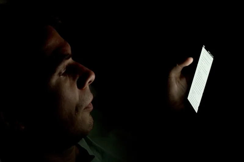
Picture the actual moment. It's 07:42, they're wedged into a carriage on the Northern line, one hand on the rail, the other holding a phone at an angle. They will give your notification roughly 1.2 seconds before deciding whether it deserves a thumb.
That means the first line is the whole message. Not the headline, not the emoji, not the brand name — the first line.
Compare:
Hey there! 👋 We've got something exciting for you — don't miss out!
with:
Your 09:15 to Leeds is delayed by 12 minutes
One is a greeting. The other is a reason to keep you installed. Notice the second one doesn't say "we". It doesn't say "exciting". It leads with the thing the person cares about, in the words they'd use themselves.
Three rules worth pinning above the desk:
- Lead with the specific, not the promotional.
- Never open with "Hey" or a wave emoji. It reads like a stranger at a bus stop.
- If the message could go to every user identically, ask yourself whether it needed to exist at all.
The first three messages are an audition
Treat early pushes as an audition for the fourth. Most apps blow through this window with a welcome message, a feature tour and a discount code, then act surprised when the toggle goes off.
A better order:
- Proof. A message only your app could send, delivered at a moment it's genuinely useful. Order dispatched. Score updated. Bill due tomorrow.
- Timing. One that shows you understand when not to bother them — a reminder that lands twenty minutes before it matters, not three days.
- Control. One that hands the wheel back: "Want fewer of these? Pick what you hear about." Counterintuitive, but giving people a volume dial keeps them subscribed far longer than pretending you'll self-regulate.
Marketing can come later, once trust exists. It cannot come first.
Quiet hours are a scheduling bug, not a personality trait
British working patterns are fairly legible. There's a commute window, a lunchtime dip, a five o'clock school-and-tea scramble, and a soft stop after about 21:30 when phones get put face down. Send into the gaps, not over them.
Then there's the bit that catches teams out every October: the clocks. Schedule in UTC and your 08:00 commuter nudge becomes a 07:00 one when BST ends, or a 09:00 one when it returns. It's the least glamorous item on this list and the one most likely to earn you an uninstall from someone who liked you right up until you woke them on a Sunday.
Make quiet hours a real rule in your sending system, not a note in a Notion doc. Weekends and bank holidays included — nobody wants a "We miss you!" on an August bank holiday Monday.
Measure the boring numbers instead
Open rate flatters everyone and tells you almost nothing. The figures that matter are duller: permission grant rate at the point of ask, toggle-off rate in the first 30 days, and how many people still have notifications switched on at 90. That last one is your real notification health.
If it's falling, look at the first three messages before you touch anything else.
Before you ship
- Does the ask land after a moment of value, not on first open?
- Does the pre-permission screen explain the benefit in plain English?
- Would the first message make sense on a lock screen at 07:42?
- Are quiet hours enforced in code, including the clocks change?
- Can a user choose which categories they receive?
Notifications are the loudest thing your app does. Worth spending more than four seconds on.