Stop Designing Onboarding for a Quiet Desk: Lessons From the 07:42 to Waterloo
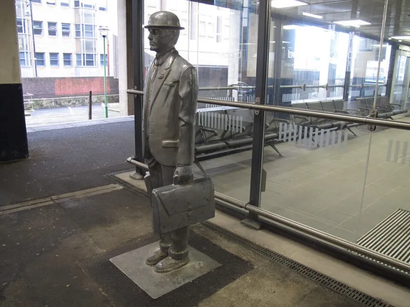
Photo: Stephen Craven , CC BY-SA 2.0, via Wikimedia Commons
Here is a design brief that never makes it into the Figma file: your user is standing on a cold platform, holding a coffee, watching the departure board flip from Platform 4 to Platform 9, and trying to sign up before the train doors close. That is not an edge case. For a lot of UK apps, it is Tuesday.
At Apporio, we think a lot of onboarding problems are not really onboarding problems. They are context problems. We design for a quiet desk, a strong connection and someone with two free hands. Then we act surprised when activation sags.
The commute is the honest usability lab
The 07:42 to Waterloo is not a controlled environment. The Wi-Fi drops between stations. The train is packed. Someone is breathing on your neck. The ticket barrier demands a quick, decisive action. The coffee queue moves in unpredictable bursts.
That is where a lot of app sessions actually happen: in fragments of 40 seconds, two minutes, a tunnel and a delayed platform change. If your first-run experience needs three uninterrupted minutes and a stable connection, you are asking for a behaviour most commuters cannot reliably give you.
Your sign-up flow is a ticket barrier
Ticket barriers work because you do one thing: present a valid ticket and move. You do not fill in a profile, confirm an email, choose a password with two symbols and a roman numeral, then watch a tutorial before the gates open.
Many onboarding flows are a queue of barriers. Email verification. Password rules. One-time code. Profile photo. Notification permission. Location permission. A tour that explains the app before the user has done anything useful. Each step might be reasonable on its own. Together they ask a distracted person to make a series of commitments before they have seen the value.
Let people browse first. Save progress locally. Ask for the minimum. Consider passkeys or magic links, but think about the context: a link that expires while someone is underground is not clever. A password manager prompt in a tunnel is not a delightful moment.
Wi-Fi gaps are product states, not exceptions
Connection loss is not a rare error. On a UK commute, it is part of the journey. Your app should treat it that way. Cache what you can. Queue actions. Retry sensibly. Keep form state. Show a clear offline message with a next step.
Do not wipe a half-completed form because the signal vanished. Do not show an infinite spinner and call it loading. Do not make the first screen depend on a video. If the app needs network to show anything useful, design a genuinely useful empty state.
The goal is not to make the app work perfectly offline. The goal is to make interruption survivable.
The coffee queue test
Can someone complete the first meaningful action in 30 to 60 seconds? That is a decent test. One decision per screen. Large tap targets. Clear skip options. A back gesture that does not destroy data. Generous code timers. No tiny close button that turns a queue into a rage tap.
The user is not stupid. They are interrupted. Designing for the interruption is not dumbing down the product. It is respecting the moment.
Permissions are not a personality
Notifications, location, contacts, tracking. These are not onboarding decorations. Ask at the point of value, explain the benefit and make sure the app still works if the answer is no.
A permission prompt before any value is a tax on curiosity. A commuter who says no to notifications on the platform might say yes later, once the app has proved useful. Give them that chance.
Design for the return
Most mobile sessions end abruptly. The train arrives. The boss calls. The signal drops. The user comes back ten minutes later, or tomorrow. When they do, show them where they left off. Do not restart the tutorial. Do not make them re-enter the same details.
Persist progress. Show continue. This is not just politeness. It is retention. The returning user is often the one who was interested enough to come back, and a reset flow is a strange way to thank them.
Measure the messy version
Look at time to first value, drop-off by step, network type, retries, session length and resume rate. Test with a throttled connection. Test in airplane mode. Ride the line with a test device. Watch where people hesitate, not just where they tap.
The useful insight is rarely just make it shorter. It is usually make it resumable. Make it tolerant. Make it work when the world is not cooperating.
A small checklist
- Value before account creation
- One decision per screen
- Local drafts and saved progress
- Offline states that explain the next step
- Permissions deferred until they make sense
- A clear continue path after interruption
- Testing on low signal, not just office Wi-Fi
If your onboarding works at 07:42 with one bar of signal and a coffee in one hand, it will work beautifully at a desk. Build for the commute and the calm will take care of itself.