Two Taps to Yes: Building App Store Screenshots That Survive a Scrolling Thumb
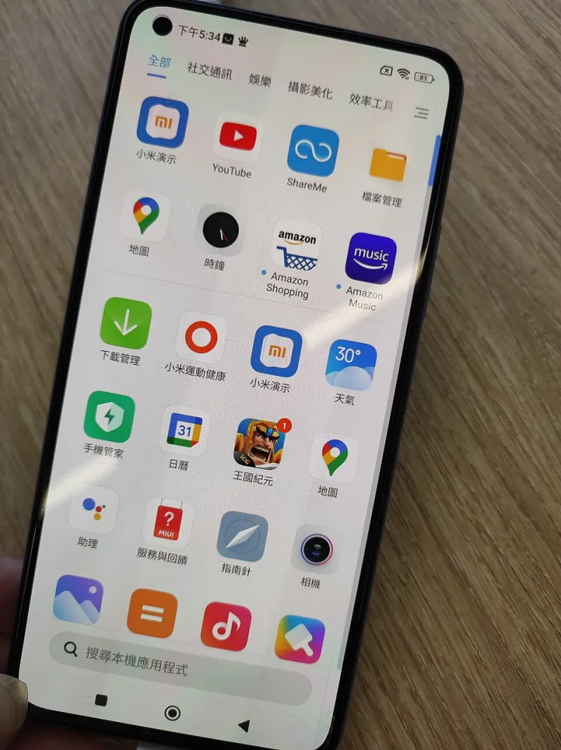
Photo: Mx12 MK M616, CC BY-SA 4.0, via Wikimedia Commons
Most people in the UK do not read app store listings. They glance, scroll, and decide with a thumb already halfway to the next result. That is not a knock on users. It is a design brief. Your screenshots are not supporting material for the description; they are the demo, the proof, and the first impression all at once.
Your store page is a landing page
A landing page has a job: move one person from vague interest to a clear next step. An app store listing has the same job, only with less space and more competition. The first two screenshots are your above-the-fold section. On a phone, in a bright kitchen, on a train with one bar of signal, they have to answer three questions: what does this do, who is it for, and why should I trust it?
Founders often brief screenshots last. The product is finished, the description is written, and someone remembers the gallery on a Thursday afternoon. That is backwards. If the screenshots are the product for most browsers, they deserve a proper brief, a proper review, and a proper test plan.
One promise per frame
A useful system is to treat each screenshot as a single sentence. Not a feature list. Not a dashboard tour. One promise, made legibly.
Frame one: the outcome. Say what changes for the user in plain English. 'Plan your week before your first coffee' beats 'Task management, calendars, reminders and notes'. The second is accurate and forgettable. The first gives someone a reason to care.
Frame two: the proof. If you have a rating, a review count, a certification, or a notable integration, put it here. 'Rated 4.7 by 1,800 UK users' is stronger than a gold badge with no context. If you do not have proof yet, use a concrete use case instead. 'Works offline on the Tube' is proof of a sort: it tells me you have thought about my day.
Frame three: the daily loop. Show the app doing the thing, not the settings screen. Use a real device frame sparingly. Crop close enough that the interface is readable at thumbnail size. If the text in your screenshot needs a pinch to read, it is not doing its job.
Frame four: trust. This is where UK-specific detail earns its place. Data stored in the UK or EU. No card details needed to browse. Support hours that match a UK working day. Clear pricing in pounds. A simple statement about how you handle permissions. These are not glamorous, but they answer the quiet worries that stop a download.
Frame five: the edge case. If your app is for freelancers, show an invoice. If it is for carers, show a shared calendar. If it is for small shops, show a stock count at 5pm on a Saturday. Specificity beats polish.
Stop wasting your best pixels
A common mistake is using frame one for a feature grid. You have seen the listings: 'Track. Sync. Share.' in three coloured boxes, with a tiny phone mockup underneath. It looks tidy and says almost nothing. The best pixels are spent on a list of capabilities the user has not yet decided they need.
Another is the logo splash. Unless your brand is the reason people are searching, a full-screen logo is a wasted frame. The user already knows the name from the search result. Show the outcome instead.
A third is the crowded dashboard. Founders love the dashboard because it proves the product is real. Users love the outcome because it proves the product is useful. Crop the dashboard to the one number or one action that matters, and write a headline that explains why it matters.
UK proof points that land
Local detail works when it is useful, not decorative. A Union Jack in the corner is not a proof point. 'Works on the Elizabeth line when the signal drops' is. 'Built for the UK tax year' is. 'Support from 9am to 5pm GMT' is. 'No card details to start' is.
Be careful with claims. If you say 'UK-based support', make sure the team is actually UK-based. If you say 'GDPR-ready', explain what that means in plain English. If you use a review quote, keep it short and attribute it properly. UK users are not cynical by default, but they are quick to spot a listing that is trying too hard.
Tests worth running
You do not need a twelve-variant experiment. Run one clear test at a time and give it long enough to mean something. App Store Connect product page optimisation and Google Play store listing experiments both let you test creative without rebuilding the app.
Test the first frame promise. Try an outcome headline against a feature headline. Test social proof placement: badge on frame one versus frame two. Test a 'no sign-up needed' message against a 'free to try' message. Test light versus dark backgrounds if your brand allows it, but do not change the promise at the same time.
Measure more than installs. A screenshot that lifts downloads but brings in people who delete the app in a week is not a win. Look at first-session completion, day-seven retention, and review sentiment. If the creative promises something the onboarding cannot deliver, fix the creative or fix the product.
The Friday thumb test
Once a month, open your store page on a real phone, outside, at arm's length. Ask someone who does not work on the app to look at it for five seconds, then tell you what it does. If they cannot, your first frame is too clever. If they can, ask what they would expect to happen after they tap download. That gap between expectation and reality is your next test.
Your store page is not a gallery. It is a tiny landing page with one job. Give the first two frames the attention you would give a homepage, and the rest of the listing gets easier.